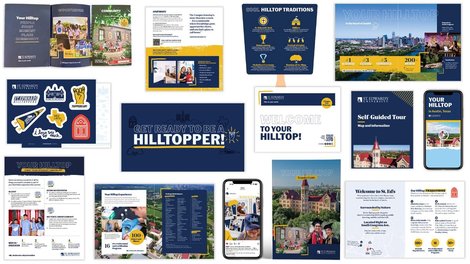
Our design components coincide with university brand colors, fonts, identities and communication style. They also give the brand a pop of personality and can act as useful graphic markers to call attention to important information points.
Design components can enhance our storytelling, highlight important information such as stats and calls-to-action and can portray character and authenticity of our brand. These elements should be used with intention rather than for decorative purposes only.
Contents
Graphic Elements | Iconography | Design Components in Use | Downloads
Graphic Elements Bundle

Highlight Frame
The Highlight Frame is used to emphasize images, quotes, important areas or stats.
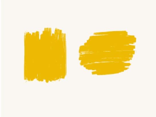
Highlight Areas
The Highlight Areas graphic element can emphasize short, important info, like stats
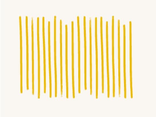
Highlight Line Pattern
The Highlight Line Pattern can frame corners or overlay on top of elements

Highlight Underlines
The Highlight Underlines graphic element emphasizes full word or bottom ligatures
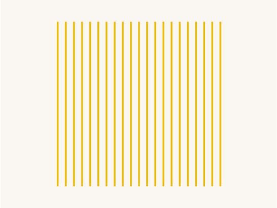
Line Pattern
The Line Pattern graphic element can frame corners or overlay on elements
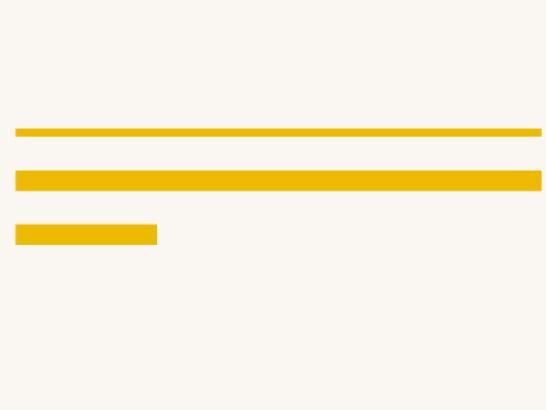
Divider Lines
Divider Lines act to divide elements or highlight stats, numbers and quotes

Circles
Circles are elements that can be used to highlight stats and icons

Sketch Circles
Sketch Circles are graphic elements that can be used to emphasize 1–2 words, stats or icons

Hillburst
The Hillburst highlights stats or important info

Background Texture
Background Texture can be used for backgrounds or as a highlight behind an isolated image or object

Handwritten Hilltop
Handwritten Hilltop can be used sparingly to add visual personalization to messaging. The Adobe font PF Reminder can be used in Regular, Medium and Bold weights.

Arrows
Arrows can draw attention to Handwritten Hilltop highlights, stats or other elements
Graphic Elements Guidelines
- Use graphic elements to highlight important call-outs, such as top things to know, stats, etc.
- Monitor use to match the tone of the piece
- Avoid using too many elements at once — use elements sparingly and with intention
- Only use graphic elements in our brand colors (best used in the primary colors)
Iconography
Icons can enhance navigation and comprehension by quickly drawing attention to important messages. Our icon style represents the core St. Edward's brand. No other icon style should be used. Use icons with intention, and at an appropriate size for the communication piece.
Review the examples and guidelines carefully before using the files. If you have questions or are in need of additional icons, please reach out to us.
Iconography Guidelines
Icons should be used in a purposeful manner to maximize comprehension when calling attention to important pieces of information. When using icons in your materials, please keep the following in mind:
- Avoid using icons solely for decoration or visual interest, as it detracts from their intention elsewhere.
- Consider the surrounding context of the icons. If icons are cluttered and not spaced appropriately, it can lead to more visual noise and confusion.
- When creating materials, it's important to have a balanced mix of photography and iconography.
- Icons should always be used at a smaller size. This is particularly important when creating digital materials that will be viewed on a mobile device.
- If you use icons outside of what is provided or created by the Marketing Office (such as from a stock website), please ensure they align with our iconography style. If you're unsure, please reach out to check if your icons meet brand standards. St. Edward's icons should:
- Feature thin strokes and outlines
- Use a simple/clean vs. a more realistic style
- Keep colors to a minimum
Downloads
Encapsulated PostScript (EPS) files are vector files to share with vendors, for use in printing promotional items, swag, etc. These require a design program to open them, such as Adobe Illustrator. PDF files can be opened in Adobe Illustrator for additional flexibility.