
Our visual identity is a key component of our brand, and works in conjunction with the stories we tell to our audiences.
Our visual identity consists of elements like logos, color, typography and more, coming together to tell our brand story. A cohesive visual identity indicates strength, trust and clarity to our audiences and at the same time, elements of our identity are flexible and evolve.

Mini Brand Booklet
Save, bookmark or print this mini brand booklet to use as a quick reference for creating on-brand communication materials.
Visual Identity Elements

Logo and Marks
The St. Edward's logo represents the university at the highest level, always used as the most dominant mark in communications. Other marks include Athletic marks, logo lockups, sub-brands and the seal.
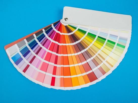
Color
Our color palette reflects our heritage and represents all of our audiences. Within the palette, primary, secondary and neutral colors are represented. Learn how to use our colors effectively in communication materials.
Typography
Correct use of brand typography is a powerful tool that can add visual meaning to our communications. Our typefaces include a variety of options to allow for flexibility when creating communications in different media.
Design Components
Design components, such as graphic elements and icons, give our brand a pop of personality and can act as useful visual markers to call attention to important points of information.
Photography
Our visual identity comes together through vibrant images that are personal, authentic and bold. Our photography style aims to engage and captivate the viewer with honest, relatable photos.
Videography
Like photography, our moving images represent our brand and who we are. Learn about videography style, how to hire a freelancer and access our university video library.