Typography is a powerful tool that can add visual meaning to our communications. Our typefaces were carefully selected to reflect St. Edward’s brand identity.
Our font stack has a wide variety of options to allow for flexibility when creating communications in a variety of mediums.
Primary Font
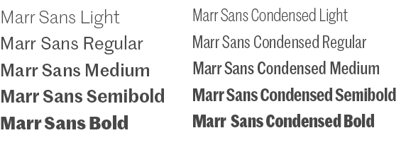
Marr Sans
Marr Sans is suited for a wide range of applications and offers a sharp, distinct and readable font in seven weights, including a condensed version.
Uses: Headers and subheads, body copy, informational text and tables, call outs (use approximately 60% of the time in a piece)
Tone: Casual, friendly, bold, fun, inviting
Publisher: Commercial Type Foundry
Styles for Use: Light, Regular, Medium, Semibold, Bold (also available in condensed)
Platforms: Print and web
Secondary Font
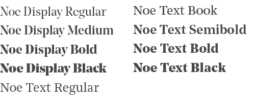
Noe
Noe was chosen for its versatility and sophistication. This unique and modern serif font projects bold confidence yet communicates with a clear purpose.
Noe is offered in display and text formats. Noe Display works well for bold and succinct text and headlines. Noe Text is multipurpose, designed for optimal readability, such as for subheads and longer body copy.
Uses:* Headers and subheads, body copy, call outs (use approximately 35% of the time in a piece)
Tone: Formal, bold, modern, professional, sophisticated
Publisher: Schick Toikka Foundry
Styles for Use: Regular, Book, Medium, Semibold, Bold, Black (available in display and text formats)
Platforms: Print and web
*Note: Be mindful of legibility when using Noe for headers, particularly when they run long, and are set on a colored background.
Display Font
Landmark
Landmark is a modern, bold and caps-only display font. The elaborate contours of Landmark require its use at large sizes (< 40 pts / px). Landmark can make a succinct, eye-catching statement but should be used primarily as an ornamental design element only, not to communicate content.
Uses: Ornamental design elements, short headlines (use approximately 5% of the time in a piece)
Tone: Fun, exciting, open, vibrant, playful, unique
Publisher: Hoefler & Co.
Styles for Use: Inline only
Platforms: Print (can be used in graphics for the web and email)

General Guidance When Using Landmark
Follow these do's and don'ts when using Landmark in your communication pieces:
Do's
- Use this display typeface as an ornamental design element only
- Limit the font to headlines and short phrases that are one to three words (with each word limited to a minimum number of characters, ideally 5-8 in length)
- Use strong action verbs to maximize the impact of Landmark
- Use Landmark at a large scale (< 40 pts)
- In general, use this display font minimally in a piece. Since Landmark is used as a large display type, it can be a dominant element of a piece, however. But it should not be dominant in the sense of conveying content. Rather, it should act as a design element that adds to the piece's tone and aesthetic.
- Set Landmark primarily in Moontower, St. Ed's Blue, St. Ed's Gold or white. The font can be used in a multi-color form but careful attention should be made to style and legibility. A small stroke or drop shadow can be added to increase legibility against backgrounds.
Don'ts
- Do not use Landmark to communicate content, particularly in long form (such as longer headers, subheads and phrases)
- The font should not be used for subheads or section heads
- Do not use any other style of Landmark besides Inline
- Do not set proper names and titles in Landmark, such as our university name
- Do not use a substitute font that resembles Landmark
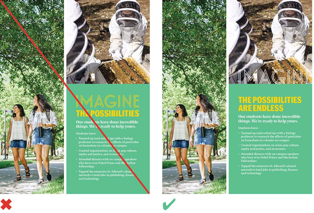
The use of Landmark on the right is an improvement since it's used as a design element instead of communicating content within a headline or sentence.
An example of Landmark being dominant as a design element versus content.

In these examples, Landmark should not be used to communicate content in headlines and sentences. The name of the university should also not be set in Landmark.
Alternate Fonts
When using software programs that utilize standard computer fonts, such as Microsoft Word, PowerPoint, or other similar programs, or creating digital communications (such as webpages or emails) when brand fonts aren't available, please use these approved substitute fonts.
| Brand Font | Alternate Print Font | Alternate Web Font* |
|---|---|---|
| Marr Sans Thin | Helvetica Light (Mac) / Arial Regular (PC) | Martel Sans ExtraLight |
| Marr Sans Light | Helvetica Light (Mac) / Arial Regular (PC) | Martel Sans Light |
| Marr Sans Regular | Helvetica (Mac) / Arial (PC) | Martel Sans Regular |
| Marr Sans Medium | Helvetica (Mac) / Arial (PC) | Martel Sans Semibold |
| Marr Sans Semibold | Helvetica Bold (Mac) / Arial Bold (PC) | Martel Sans Bold |
| Marr Sans Bold | Helvetica Bold (Mac) / Arial Bold (PC) | Martel Sans ExtraBold |
| Marr Sans Ultra Black | Helvetica Bold (Mac) / Arial Bold (PC) | Martel Sans Black |
| Marr Sans Condensed Thin | Helvetica Condensed Light (Mac) / Arial Narrow Regular (PC) | Helvetica Condensed Light or Arial Narrow Regular |
| Marr Sans Condensed Light | Helvetica Condensed Light (Mac) / Arial Narrow Regular (PC) | Helvetica Condensed Light or Arial Narrow Regular |
| Marr Sans Condensed Regular | Helvetica Condensed Regular / Arial Narrow Regular (PC) | Helvetica Condensed Regular or Arial Narrow Regular |
| Marr Sans Condensed Medium | Helvetica Condensed Regular (Mac) / Arial Narrow Regular (PC) | Helvetica Condensed Regular or Arial Narrow Regular |
| Marr Sans Condensed Semibold | Helvetica Condensed Bold (Mac) / Arial Narrow Bold (PC) | Helvetica Condensed Bold or Arial Narrow Bold |
| Marr Sans Condensed Bold | Helvetica Condensed Bold (Mac) / Arial Narrow Bold (PC) | Helvetica Condensed Bold or Arial Narrow Bold |
| Noe Display Regular | Garamond Regular | Playfair Display Regular |
| Noe Display Medium | Garamond Semibold | Playfair Display Medium |
| Noe Display Bold | Garamond Bold | Playfair Display Bold |
| Noe Display Black | Garamond Bold | Playfair Display Black |
| Noe Text Book | Garamond Regular | Playfair Display Regular |
| Noe Text Regular | Garamond Regular | Playfair Display Regular |
| Noe Text Semibold | Garamond Semibold | Playfair Display Medium |
| Noe Text Bold | Garamond Bold | Playfair Display Bold |
| Noe Text Black | Garamond Bold | Playfair Display Black |
*When creating digital communications, it is acceptable to default to standard web safe font stacks for sans serif (Arial, Helvetica) and serif (Garamond, Georgia, Times New Roman).
General Guidance
Line Length
For long passages of text, limit the column width (also known as the measure) to facilitate comfortable reading. Do not allow the line length to extend the full width of a page or a screen, particularly on larger devices, as it is hard for the eye to track back to the left margin and begin the next line, resulting in increased reading difficulty. A good goal is to aim for between 60–100 characters per line including spacing. Setting an optimal line length will break up content into easily digestible information.
Tracking
Correct letter spacing, called tracking, makes copy easier to read. In general, text should always be tracked close to the default setting, and optical kerning should be used when available.
Leading
Proper line spacing, called leading (or line height for web applications), results in professional-looking type that’s easy to read. Comfortable reading of larger passages of body copy requires more space between lines. However, larger text, such as headings, does not require as much line height as paragraphs of body text. Larger type is read as clusters of words and too much space between the lines looks disjointed and inhibits the user's ability to scan.
This body text has leading that is too tight, which makes reading the copy difficult.

Make sure to use spacing between lines with a value relative to the font size to allow for maximum readability.

On headings, leading that is too great results in vertical spacing that is too loose, hindering easy scanning.

Text Alignment
In most cases, paragraphs should be left-aligned. Cases for centering text would be in the instance of content examples such as block quotes, call outs and short blocks of text that stand apart visually from the surrounding body text (a maximum of six lines is a good rule of thumb). If too many lines of text are centered, reading becomes difficult.

If a paragraph is too long, or extends beyond a single paragraph, center alignment will inhibit comfortable reading. Also, avoid short lines of text or words (called widows) that stand alone on a line, causing the paragraph to appear uneven as a whole. Finally, avoid bad line breaks as much as possible.

Centered text is best suited for something like a short call out that has the purpose of drawing attention from surrounding page content.
Type Spectrum
Consider the intended audience and purpose of your communication to help determine which fonts work best. Use these grids as a guiding framework.


Font Licenses
Primary and Secondary Fonts
Limited font licenses are available for Marr Sans and Noe. Please submit a request if you have an appropriate use case and would like to request licenses for your computer. In addition, FedEx Office has a license and can create collateral using the font families.
Display Font
Careful guidance must be taken when using Landmark. For this reason, font licenses are limited. However, font treatments have been created for university-wide use and are available for download. Please reach out to request a specific font treatment for your project.
Terms and Conditions
- Fonts are licensed for one computer only
- Do not share fonts with others or download them to your personal computer
- University fonts should be used solely for cases outlined in these guidelines — they should not be used for the creation of logos or other graphic elements