
Color is a key component of our identity. Our color palette represents our heritage, distinguishes our brand and creates consistent experiences for our audiences.
Consistent use of color is essential to a unified brand image. Review these guidelines carefully to understand usage differences between palettes, audiences and mediums (such as print and digital). As always, reach out to us directly for questions or assistance.
Color Palette
St. Ed's is blue and gold. These are our primary colors and should be used prominently in communications to ensure brand consistency. Colors should be used in accordance with the tone of a piece and the type of communication required.
Primary Colors

Sorin
PMS: 281 C
CMYK: 100-88-38-32
RGB: 25-46-86
HEX: #192e56
Paint Match: Sherwin-Williams 6811 Honorable Blue

Gold Medallion
PMS: 7408 C
CMYK: 7-27-99-0
RGB: 237-185-32
HEX: #edb920
Secondary Palette
The Secondary Palette contains Brights and Neutrals, each containing colors designed for specific purposes.
Brights
The Brights add variety and vibrancy when used with the Primary Palette. These colors work alongside the primary colors and should be used in combination with the Primary Palette whenever possible.

Bluebonnet
PMS: 291 C
CMYK: 42-6-0-0
RGB: 139-202-239
HEX: #8bcaef

Red Doors
PMS: 1788 C
CMYK: 2-89-88-0
RGB: 234-68-51
HEX: #ea4433
Neutrals
The Neutrals should be used for informational elements such as copy, tables and digital components.

Moontower
CMYK: 76-67-67-88*
RGB: 0-0-0
HEX: #000000
*A note for print applications: Moontower is a rich black and should only be used for graphics and large text (18 points or greater). Small body text should always be set in 100% black (Grackle). Learn more about rich vs. 100% black and how to configure your settings in Adobe applications to ensure accurate printing.

Grackle
PMS: 447 C
CMYK: 69-63-65-64
RGB: 46-45-43
HEX: #262626

Bridge Bats
PMS: 4291 C
CMYK: 62-53-58-30
RGB: 89-90-85
HEX: #595a55

Anchors
PMS: Warm Gray 3 C
CMYK: 31-27-34-0
RGB: 180-174-163
HEX: #b4aea3

Waterloo
PMS: 7527 C
CMYK: 11-10-23-0
RGB: 226-219-196
HEX: #e2dbc4

Limestone
PMS: 7527 C (30%)
CMYK: 2-3-5-0
RGB: 247-243-237
HEX: #f7f3ed
Paint Match: Sherwin-Williams 7036 Accessible Beige

Sorin Tint
PMS: 281 C (5%)
CMYK: 7-4-1-0
RGB: 232-237-245
HEX: #e9ecf4

White
CMYK: 0-0-0-0
RGB: 255-255-255
HEX: #ffffff
Color Usage
Pairing colors is a tricky endeavor and not an exact science! Use your best judgment and limit the number of colors used to avoid a rainbow look. It's best to use the Primary Palette the most, which can also include white. The palette should rely on secondary colors in accordance with the tone and type of communication.
Please keep in mind that variables could affect limitations such as text size, font, etc. If in doubt, reach out to us.
Color Ratios
Primary Palette
Our blue and gold have been brought together into one primary palette that prioritizes consistency and brand recognition. These are our school colors. Every layout should use the Primary Palette in some way. This palette should be dominant over other colors and express the foundation of our brand. Of the two, Sorin should be used more than Gold Medallion (gold being more of an accent).
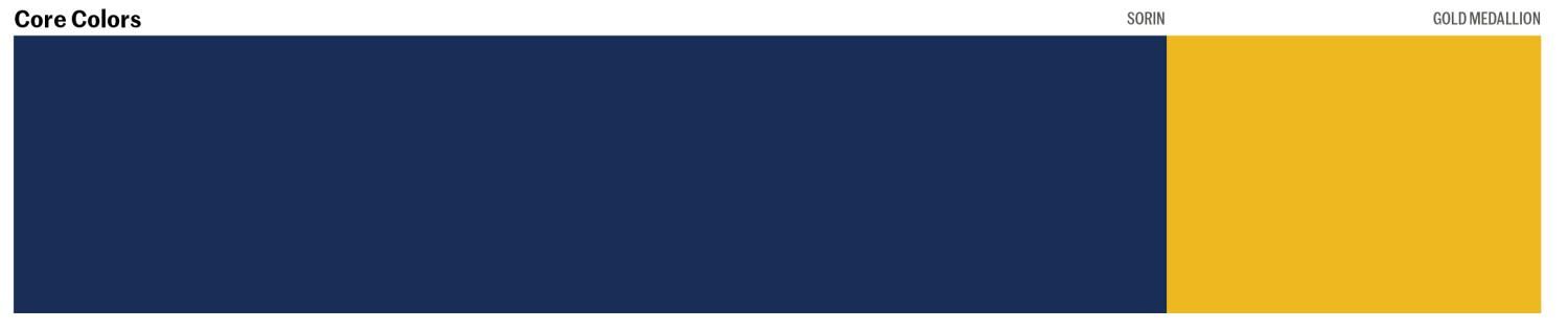
From left to right: The core colors of the Primary Palette, Sorin blue and Gold Medallion. Sorin's usage proportion is shown at approximately 75–80% as compared to Gold Medallion, which should be used sparingly as an accent color.
Secondary Palette
Brights
The Brights add variety and vibrancy when used with the Primary Palette. These colors work alongside the primary colors and should not be used completely on their own.
Colors in the Brights Palette add variety and vibrancy but should be used sparingly and as accents to complement colors from the Primary Palette (keep in mind vivid photography can also add to the vibrancy of a piece). In most cases, colors from the Primary Palette should take up a larger percentage of your piece, with the Brights taking up 10–15%. Bluebonnet and Red Doors can be used in equal proportion, as long as they are secondary to the Primary Palette.

From left to right: The Brights of the Secondary Palette — Bluebonnet, a light blue, and Red Doors, a deep, vibrant red. It’s recommended to use Bluebonnet more than Red Doors; however, the two colors can be used in equal proportion, as long as they are used sparingly overall and remain secondary to the primary palette.
Neutrals
The Neutrals are used for informational elements such as copy, tables and digital components. By nature of their purpose, colors from the Neutrals Palette should be used the least. Backgrounds can use Limestone or Sorin Tint, depending on context, to frame layouts and create structure through color contrast.

From left to right: The Neutrals of the Secondary Palette — Moontower (black), Grackle (dark gray), Bridge Bats (medium gray), Anchors (pewter), Waterloo (medium beige), Limestone (light beige) and white. The usage ratios for all neutrals are equal. However, it's encouraged to use white more often in conjunction with both palettes.

Color Ratio Chart
- Primary colors, Sorin and Gold Medallion, should be dominant in pieces, particularly when brand awareness is low. Gold Medallion should be used as an accent color, with Sorin being the most dominant color. Neutral colors, particularly white, and vibrant photography can help provide balance.
- Secondary bright colors, Bluebonnet and Red Doors, should be used sparingly as accent colors. Secondary neutral colors can be used for backgrounds and informational elements.
- Sorin: 85% usage
- Gold Medallion: 15% usage
- Secondary brights (Bluebonnet and Red Doors): 5–10% usage
- Secondary neutrals: 5–40% usage (depending on application)

Color Workshop Training
Explore resources, guidance and tips on how to use the St. Edward's color palettes effectively for your materials!
Color Pairings
Primary Palette
Brand recognition is important. Communications to prospective students and families with a lower awareness of St. Ed's should use primary colors predominantly and secondary colors sparingly (most often as accent colors), and always in conjunction with primary colors as the dominant palette in the piece.

Secondary Palette
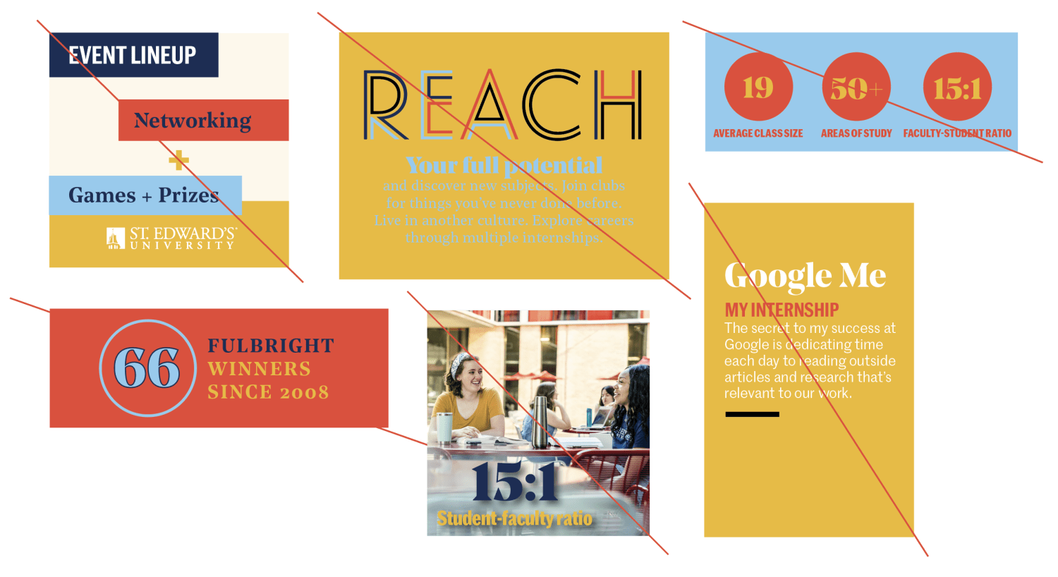
Colors from the secondary palette add variety and depth to communication pieces. When awareness of St. Ed's is higher, secondary colors can be used in a broader way. The type of channel and tone of the piece (such as a social media post promoting an event to current students or a swag item for orientation) can also open the door for greater use of the secondary palette. In addition, illustrations and photography are excellent tools to add vibrancy and color to a piece.
Download Color Pairings and Schemes

General Guidelines for Pairing Colors
Follow these do's and don'ts when combining colors in your communication pieces:
Do's
- When in doubt, default to the Primary Palette.
- To maintain brand uniformity, colors from the Primary Palette should almost always be dominant in a piece.
- When using the Primary Palette, use Sorin the most — Gold Medallion should act as an accent color.
- In general, use colors from the Secondary Palette as accents.
- In most cases, colors from the Secondary Palette should be used in conjunction with colors from the Primary Palette (not by themselves).
- To ensure readability (and avoid your materials taking on a rainbow look), it is important to use a restrained color palette. Color, particularly, should be restrained when vibrant and colorful photography is used. Limiting your piece to 2–3 colors and using color as small pops of design to play off colors in a photograph are recommended practices.
Don'ts:
- Don't place colors together that do not have enough contrast with one another.
- Don't add different colored strokes to colored text.
- Avoid excessive drop shadow on type.
- Don't place colored type on a busy photo or background.
Legibility and Accessibility
Above all, the use of color should never hinder legibility or restrict access to your message to any audience.
- Be mindful of print production limitations and screen accessibility when creating your communication pieces.
- Adhere to AAA standard contrast ratios so your communication pieces can be understood by all audiences.
- As a general rule, large chunks of body text should be set in black.
- Text is usually easier to read when it's not reversed on a dark background.
Learn more about Website Accessibility

Color Guidance
Use this color contrast grid* to determine the proper accessibility for our color palette. Check to see that the color of the background and foreground has sufficient contrast.
*Best viewed by downloading
Downloads
Color Palettes (ASE) — Print | Digital
Color Pairings and Schemes (PDF)
Color Contrast Grid (JPG)
Adobe Swatch Exchange (ASE) files work in design programs such as InDesign, Illustrator and Photoshop. Load these color files to your program to easily access our color palettes.
Import instructions for Adobe Photoshop, Illustrator or InDesign:
- Download the appropriate ASE file for your application (print or digital)
- Open your swatches palette by clicking the Menu > Window > Swatches
- Click the fly-out menu and choose “Load Swatches” or “Open Swatch Library/Other Library”
- Navigate to the ASE file
- Your swatches will open up in a new swatch palette in your design program