
Maintaining Our Topically Based Website
When stedwards.edu was redesigned in 2015, we moved from an organizationally based website to a topically based site. This means that all content should be organized logically, even if it doesn’t align with our organizational structure. The goal is to better serve our audience: They’re able to find the information they’re looking for, even if they know nothing about university structure.
Tip: Categorize your content according to your audience’s needs, not our organizational structure.
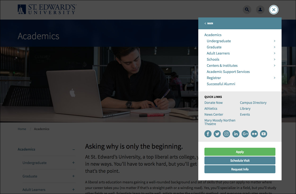
Stedwards.edu uses mobile-friendly navigation across all versions of the site, and it’s found in the top-right corner of the site (the “hamburger” menu).
Our content management system (CMS) defines what navigation shows up for users on each page. Content owners do not have the ability to adjust what navigation appears on the left-hand side of their page.
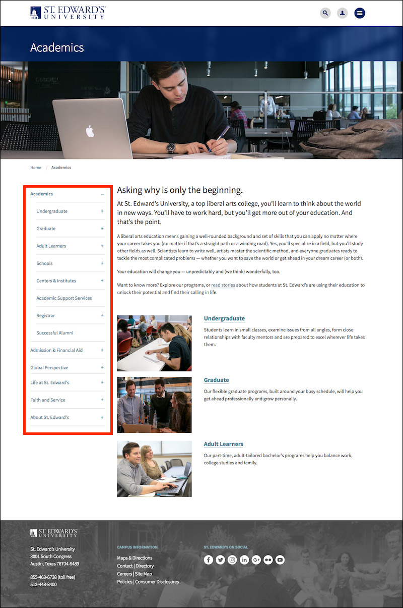
At any time, users can get back to stedwards.edu homepage by clicking on the logo on the top-left corner of each page.
The order of pages within a pageset should be determined by how users will experience the content. Think about how the audience to our site would naturally navigate among the pages.